 Australia
 Austria
 Belgium (Dutch)
 Canada (English)
 Denmark
 Estonia
 Finland
 France
 Germany
 Ireland
 Italy
Italy
 Japan
Japan
 Luxembourg (French)
 Netherlands
 New Zealand
 Norway
 Poland
 Portugal
 Romania
 Singapore
 Spain
Spain
 Sweden
 Switzerland (French)
 USA
USA
 United Kingdom
 Other Countries


In general, we see a collective longing to begin socializing again. No one could have imagined how 2020 would affect us, and the absence of physical meetings has influenced us immensely. Thanks to our ability to learn and adapt to the new everyday life, many smart solutions have emerged in the wake of the pandemic. Home offices have become an important part of many people's everyday lives and the distinction between leisure and work is no longer clear. We want to create homes to thrive in and are happy to decorate according to our own needs rather than slavishly following trends. What do I like and what things do I want to surround myself with? Personal expression is in focus; perhaps we can even sense an "anti-trend" trend.
Trend 1 - Natures spectrum
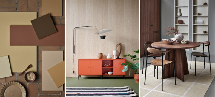
In this trend, we have a focus on security, calm and wellbeing. This theme is a direct effect of the pandemic and its uncertainty. It is close to nature, preferably with rich colors that are reminiscent of earthy vegetables and nature in general. We also see natural materials such as linen, fabrics and darker woods that create a warm and cozy feeling. Handcrafted qualities are in evidence, and we humans want to work with our hands again. The result is not the most important thing here – the creative process is the purpose. We decorate with personal items that are often inherited; these family heirlooms now occupy the limelight. We want the items and furniture in our homes to be carefully selected, and infused with a history.
We value the analog, and gladly allow things time to develop and grow. This includes everything from home decor to the food we cook and eat. Slow-cooked meals, home-grown vegetables and sourdough bread epitomize this notion.
Wall colors dominate, usually in safe beige tones and restful greens. On the walls we want to hang unique art and paintings with a story.
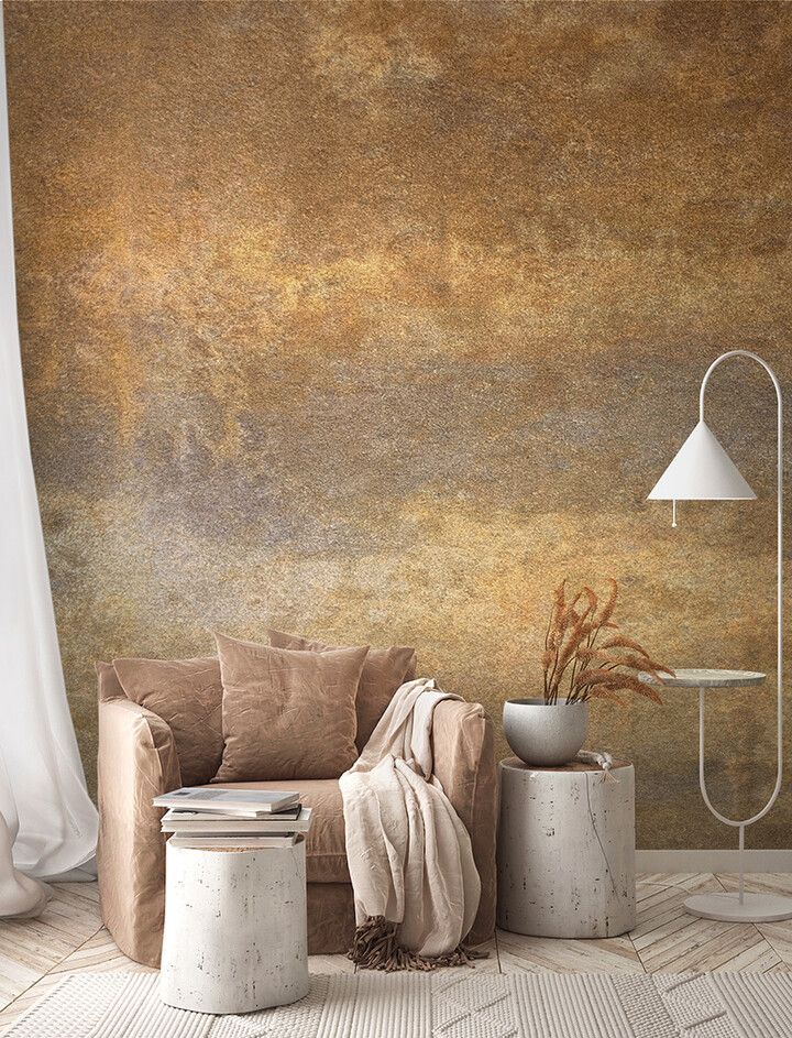
Main colors are earthy tones:
- Khaki green
- Orange red
- Beige
- Brown
Accent:
- Sage green
Inspiration from:
- Small scale
- Organic products
- Multipurpose tools
- Traditional checked patterns
- Vintage tinplates
- Soothing, welcoming environment
- Historical influences
- Patina
- Art
See all wallpapers from the Nature's spectrum trend here.
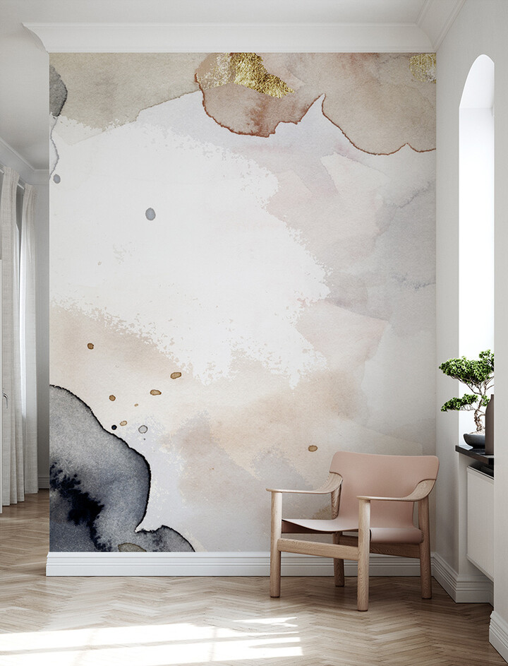
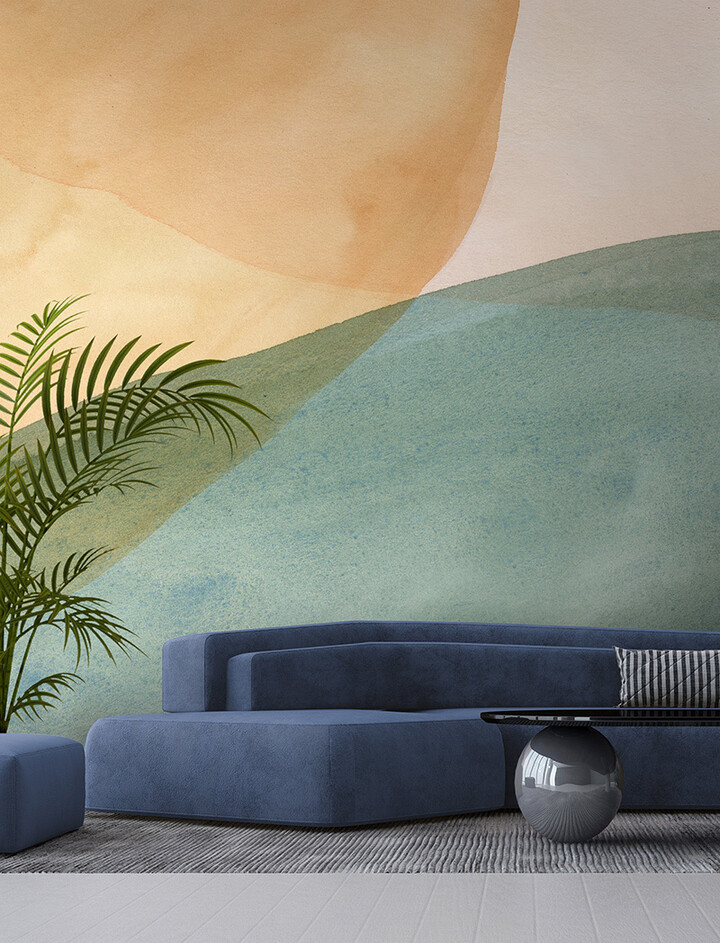
Trend 2 - Laconic Spring
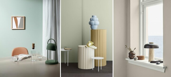
Many of us long to travel because of the pandemic's limits on our mobility. We are attracted to distant places and want to experience something new. We yearn for sandy beaches, peace and relaxation. However, in addition to an ongoing pandemic, we are also in the midst of a serious climate crisis; we must look in our vicinity and discover the natural environment around us. Now, in these times, we really want to go outside and experience nature. We long for more than urban roof gardens; we want to grow things ourselves, and on a larger scale. We want to breathe fresh air and take in magnificent views far from the city. We're moving from cities to the countryside. We strive for a calmer and healthier lifestyle, both inside and out.
In terms of color, this trend features sandy tones, various beige shades, sunny yellow, and lavender with hints of cool blue. In many details, we see the blue color that was previously more of a base, but which now livens up the decor and stands out on its own. Walls play a more supportive role in our homes; while they are not necessarily the primary feature, it would not be possible to capture the desired atmosphere without the right wall color scheme and choice of motifs.
Main colors: restful, cool tones
- Sand colors
- Light blue tones
- Eggshell
- Lavender purple
- Lemon yellow, sunshine
Accents:
- Azure blue
- Olive and laurel greens
- Mild terracotta tones can appear here and there
Inspiration from:
- Fresh water
- Crisp morning air
- Bare tones
- Details from duck-egg to azure
- Afternoon light
- Glass
- Bone
- Eggshell
- Salt
- Light shadow
- Light wood
See all wallpapers from the Laconic spring trend here.
Trend 3 - Colors
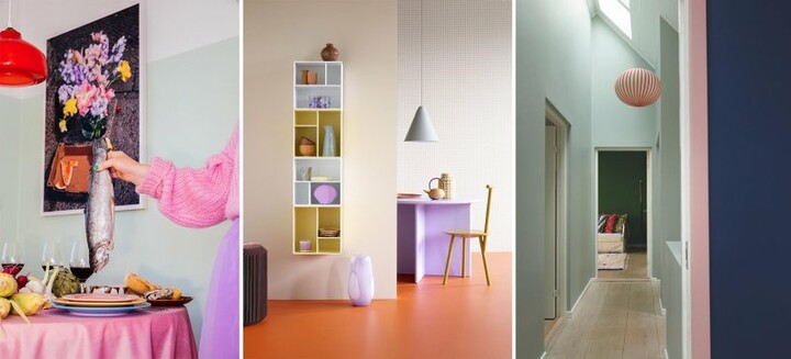
This trend feels exciting, and is quite possibly the most "daring" of the four. It can be compared to the fresh, vibrant feelings we experience as spring arrives. It is a carefree atmosphere that exudes playfulness and youth. One could say that our “Jubilation” trend from autumn 2020 has grown up and moved away from home. Why? Because this trend features lot of color and a personal touch for everything. This is a considered style for those who want to express themselves and their personality. Activism is an important part of this idea, and you are happy to express what you think and feel about various issues.
Here, the walls become a playful base, in strong colors or sometimes several different colors, and then usually divided into blocks or other geometric figures. Contrasts take place and the wall forms the main stage. In terms of color, shades are bold and they contrast well with each other. We move among tones of purple, green, yellow and pink. All of these create an intense mix, where we are not afraid to combine the colors on large surfaces and objects. Could it be the expression of hope that brighter times are in store – and a middle finger to the ongoing pandemic?
Main colors:
- Purple
- Subdued deep green
- Pink pink
- Apricot-orange
Accents:
- Lime green
- Black
Inspiration from:
- The plant world
- Macro-photography
- The eighties
- Street art
- Positive vibes
- Upcycling
- Graphic lines
- DIY
- Creativity
See all wallpapers from the Colors trend here.
Trend 4 - Clean slate
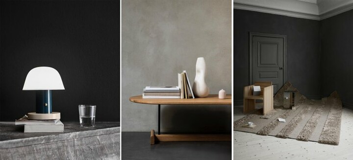
Time to clean up, streamline and start anew. We are looking for a fresh beginning, free of bacteria and viruses. In this trend, we re-use existing materials to create new ones. This means that because these new materials are a mixture of old ones, they retain a subtle tone of original color – gray, light brown or other faint shades – to remind us that the material was once something else.
We strive to have cleaner air as well as easily cleaned surfaces. If white and black were previously base colors, they are now seen on details rather than large wall surfaces. Gray and blue in most shades dominate in this trend. Contrast is created between surfaces, materials and color saturation.
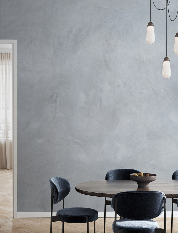
Main colors:
- Gray and blue in all their variants
Accents:
- White and black
Inspiration from:
- Industry
- Recycling
- Denim
See all wallpapers from the Clean slate trend here
---
Anna María Larsson is a creator, inspirator and DIY professional. She is of the firm opinion that everyone is creative and can come up with ideas; it only requires a little training. She appears on a regular basis on TV, holds workshops and gives lectures. She shares what she creates and offers inspiration with her blog and Instagram account @dnilva.